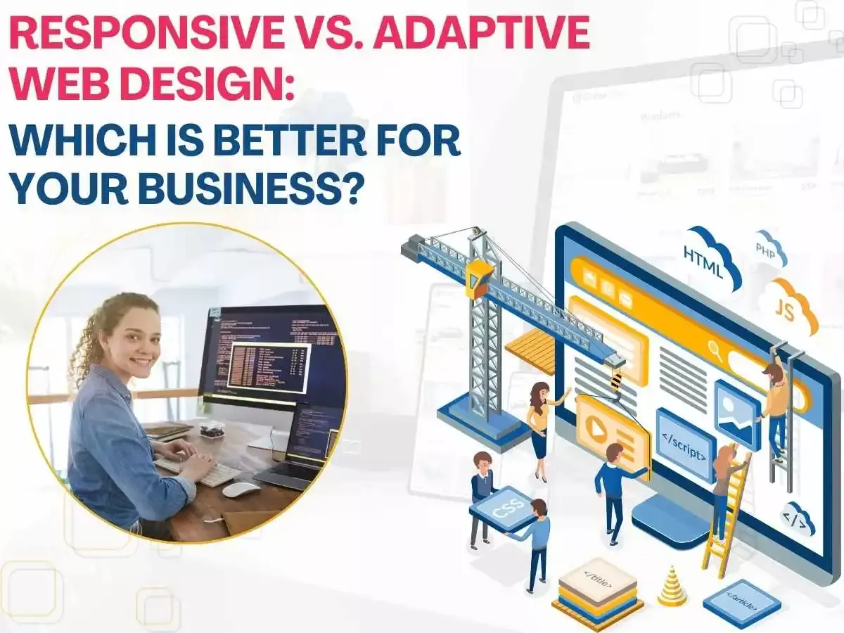
Discover the key differences between responsive and adaptive web design. Learn which design strategy is better suited to enhance your business’s online presence.
Creating a website takes a lot of thought and effort. From being accurate and efficient to being user-friendly and easy to navigate, there are a lot of conditions that come into the picture. One of such considerations that may act as a dilemma for business owners is to choose between a responsive website design and an adaptive one. Even though a website design agency in Toronto aims towards a seamless and smooth user experience, web design in Toronto can differ in its user experience, user interface, and overall website layout. Here is what you need to consider before making a choice:
Responsive web designs
Responsive web designs focus on fluidity and flexibility. It refers to a kind of design that adjusts according to the device you are operating it from. The design and layout are adjusted, reformed, and modified to meet user requirements and ease of understanding as well as navigation. The advantage of such a design is how it works seamlessly across multiple platforms and is screen-friendly regardless of the device. Yet, a downside of such a platform is that it can falter and be distorted with low-bandwidth devices or older platforms, and it needs regular maintenance or attention.
Adaptive web designs
Adaptive web designs, on the other hand, create a structured and systematic approach instead. They create different web design layouts according to a few different types of screens, varying from devices to interfaces. Adaptive designs are good for businesses that want to maintain a feeling of familiarity across different platforms. The website designers in Toronto emphasize the importance of consistency. However, one disadvantage of adaptive web designs can be that they need additional updates every time a new type of screen with a unique screen size and layout enters the market.
Conclusion
Both designs work differently and can be chosen depending on the requirements. Ultimately, each flexible and adaptive web design has advantages, and the ideal option for your company will rely on your unique objectives, target market, and available resources. Prioritising user experience and selecting a design approach that best suits your business goals are crucial, regardless of whether you’re going after ones who are mobile-savvy and on-the-go or trying to create a consistent desktop experience. Eccentric Business Intelligence Toronto works on Website Design Agency in Toronto, catering to user needs and challenging problems, providing feasible solutions, and integrating user interface and user design into a seamless developmental process.

